Case Study: How Natural Pet Innovations Launched Fast and Grew Strong
The Challenge
Our client was acquiring a white label product supplier, and came to us for help as they were legally bound to launch as a new brand in a fixed timeframe. That meant creating a new company name, logo, brand identity, website — the whole shebang — and fast!
Strategy and Services Provided
To meet goals under a such tight deadline, we leveraged analytics to inform the company name reverse-engineering what potential clients search for. Next we crafted a clean, professional brand identity rolled out on a modest yet fully-functional website, with plans to scale it up.
Once the logo and website were established, we delivered these additional services:
- Digital Design: Social Media Image Support, Blog Posting (from a Heck Yeah! Partner)
- Proprietary Subsidiary Icon Designs
- Print Design: Product Catalog
- Brand Consulting & Stewardship
The Results
In just 26 days we launched the brand via website, established guiding principles for all future marketing collateral materials, and began design on a product a catalog to fuel aggressive growth. View their website here.
The launch was such a success, my partners and I were asked to continue to support the client with ongoing blog posts, email marketing campaigns, a social media presence, proprietary logos, icons, and other collateral materials.
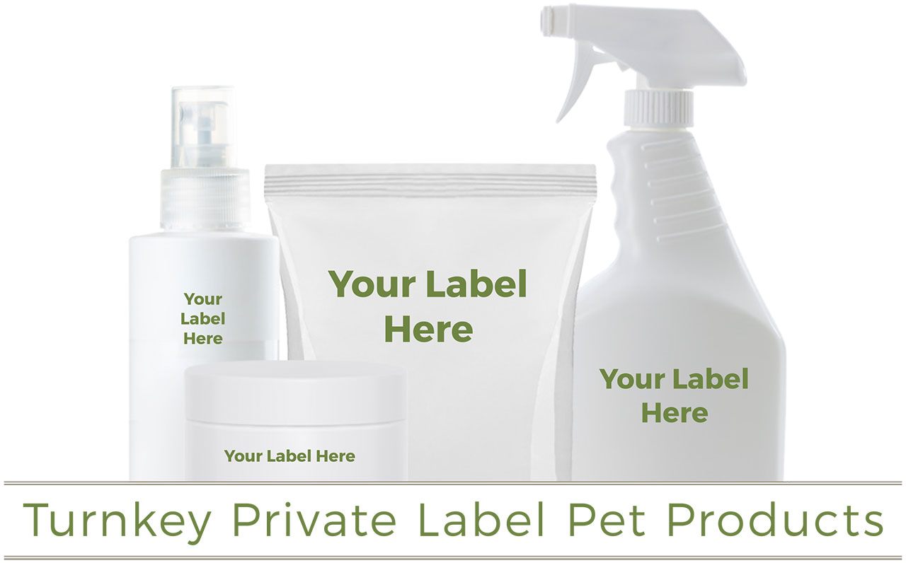
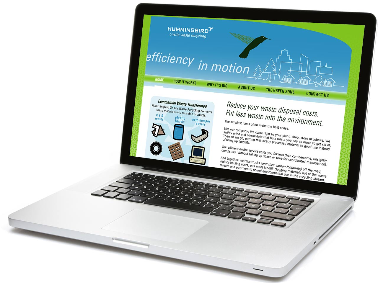
Brand Launch via Website Design
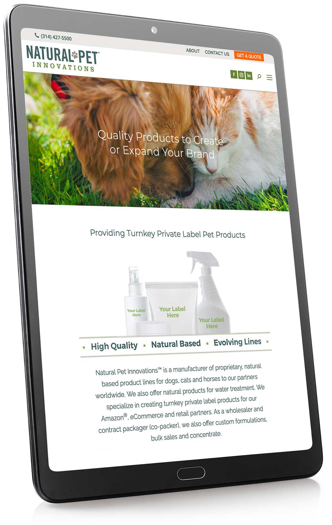
Naming and Logo Design
“The Heck Yeah! team was awesome! I had a really, really narrow window (over the holidays as well!) to create, build and deploy a brand new website for a company I was acquiring. Not only did they accept the challenge, they did so with vigor! They were more excited about the project than I was! The resulting site was very well done and right on point. It was exactly what we needed — not to mention 100% on time and on budget!”
— Ben Ackerman, Founder & CEO, Natural Pet Innovations
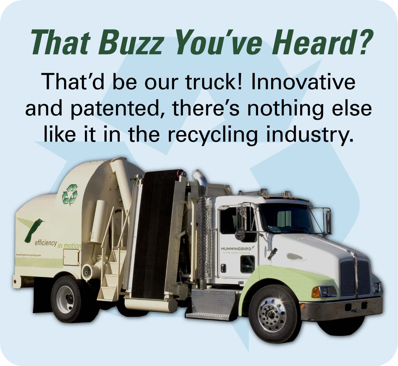
Other Select Project Assets